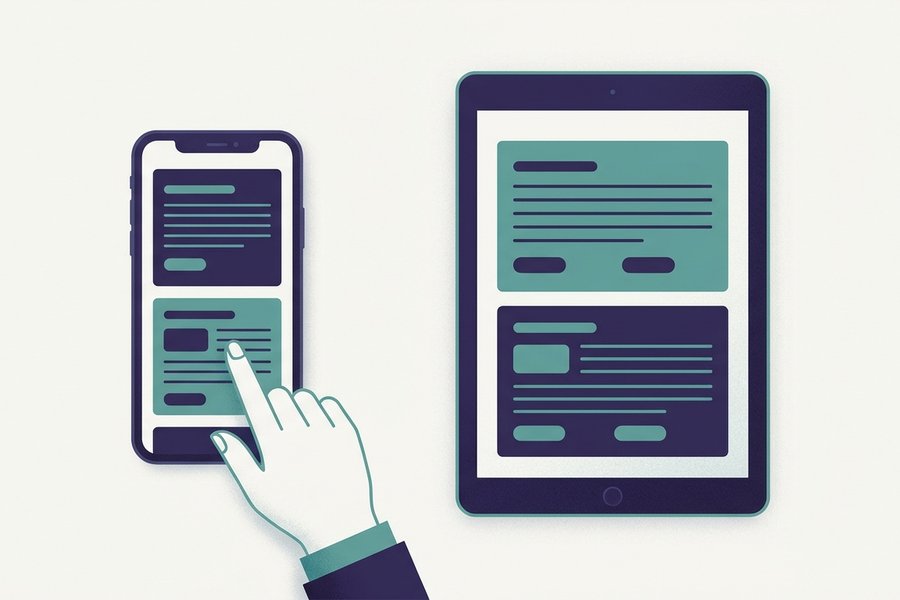
Yes, and it is the same editor, not a cut-down mobile version. On small screens the editor and preview stack vertically instead of sitting side by side. The toolbar wraps onto as many rows as it needs, so every formatting button stays under your thumb. Full-page mode then hands the whole screen to one pane, and that is what makes a phone genuinely workable.
A physical keyboard is still more comfortable for a long writing session. But reading a document someone sent, making quick edits, checking how a table renders, and exporting the result as .md, HTML or PDF all work properly on a phone in the browser editor.
At a glance
| Layout on small screens | Editor and preview stack vertically instead of sitting side by side |
|---|---|
| Toolbar | Wraps onto extra rows. No button is hidden behind an overflow menu |
| Draft storage | Autosaved to that browser's localStorage on the device itself |
| Reading mode | Full-page mode hands the whole screen to one pane |
| Sync between devices | None. Export a .md file to move a draft to another device |
How the layout adapts
- On a narrow screen the two panes stack: editor on top, preview below.
- Every desktop toolbar button is on mobile too, spread over two or three rows.
- Drafts autosave to one browser on one device. There is no account and no sync.
- Most mobile Markdown bugs come from the keyboard, so use the toolbar buttons.
Why the panes stack
On a desktop you get the classic split view, with Markdown on the left and the live preview on the right. Below a certain width that split leaves both panes uselessly narrow, at roughly thirty characters a line. So the layout stacks them instead. The editor sits on top, the preview below, and you scroll between them. Turning a tablet to landscape usually brings the side-by-side view straight back.
The toolbar wraps instead of hiding
The toolbar deals with small screens the honest way. It does not push buttons into an overflow menu that nobody ever finds. It wraps onto as many rows as it needs. Bold, headings, lists, tables, links, code and export are all present, in the same order as on desktop, just spread over two or three rows.
The preview is identical everywhere
The rendered output is the same on every device, because the same GFM renderer runs in the browser whatever the screen size. A table that looks right on your phone looks right on your colleague's laptop. Wide tables scroll sideways inside the preview, so they never drag the whole page with them.
What to expect on each device
Screen width decides the layout, not the device category. The table maps the common cases, so you know before you start whether a phone is enough for the job in front of you.
| Device | Pane layout | Toolbar rows | Live preview | Export and print | Typing comfort |
|---|---|---|---|---|---|
| Phone, portrait | Stacked, editor above preview | Two or three | Full, same renderer | Works, downloads land in your files app | Fine for edits and short notes |
| Phone, landscape | Still stacked on most phones | Two | Full | Works | Better line length, smaller keyboard |
| Small tablet, portrait | Stacked, but both panes are usable | One or two | Full | Works | Comfortable for real writing |
| Tablet, landscape | Side by side returns | One | Full | Works | Very close to a laptop |
| Laptop or desktop | Side by side | One | Full | Works, plus print to PDF | Best, keyboard shortcuts included |
One column is worth expanding. Printing from a phone browser gives the same styled output as printing from a desktop, so a phone can produce a finished document on its own.
Tip: Choose Print in the toolbar, then pick "Save to Files" or "Share to PDF" in your phone's own print dialog. That turns a Markdown draft into a PDF you can email to someone who has never heard of Markdown.
Where your draft lives on mobile
Each browser keeps its own copy
Autosave works the way it does on desktop. Your text goes into that browser's localStorage, on the device itself, never onto a server. One thing follows from that, and it is worth knowing before you rely on it.
Each browser keeps a separate copy. A draft you start in Safari on your iPhone will not appear in Chrome on your laptop. It will not even appear in Chrome on the same iPhone. No account and no cloud sync connect them. That is the honest price of an editor where nothing you type ever leaves your device.
Moving a draft to another device
- Download the draft as a
.mdfile from the toolbar. - Send it to yourself by email, AirDrop or any messaging app.
- Open the file on the other device, or paste the text into the editor there.
Exporting a file is good practice on any device for work you would hate to lose. Clearing browser data removes localStorage drafts along with everything else, and closing a private tab does the same.
Two habits that prevent lost work
- Do not write anything long in a private or incognito tab. That storage is thrown away the moment the tab closes.
- Export once a week. Some mobile browsers clear site storage when the device runs low on space, and they do not ask first.
The same storage rules explain what happens when the signal drops, which our note on using the editor offline goes into.
What goes wrong when typing on a phone
The keyboard is the problem, not the editor
Almost every mobile Markdown problem traces back to a helpful keyboard. Smart punctuation, autocorrect and CJK input modes all swap in characters that look right but are not the ASCII ones the parser needs. Here is a realistic broken snippet, typed on a phone:
[Setup guide](https://example.com/setup)
#Heading with no space
“config.json”
*   item with a smart bullet
None of that renders. Here is why:
- The parentheses are full-width, so the link stays as plain text with the brackets showing.
- The hash has no space after it, so strict parsers keep the line as a paragraph.
- The curly quotes are only cosmetic here, but they break a link the moment they wrap a URL.
Corrected, every character in a syntax position is half-width ASCII:
[Setup guide](https://example.com/setup)
# Heading with a space
`config.json`
- item with a plain hyphen
The fix: press buttons, do not hunt for symbols
One habit prevents all of it. Use the toolbar buttons instead of digging for symbols on the third layer of the on-screen keyboard. One tap wraps your selection in correct syntax, so the keyboard never gets a chance to substitute anything. If you type Chinese, our page on writing Chinese in Markdown covers the full-width punctuation rules in detail.
Watch out: iOS turns straight quotes into curly ones as you type. Before a long session, switch Smart Punctuation off in Settings > General > Keyboard, or your code spans and URLs will quietly stop working.
Five habits for a smoother mobile session
Five habits turn a workable phone session into a comfortable one. None of them takes any setup.
- Use full-page mode. Give the whole screen to the editor while drafting, then to the preview while reviewing. On a phone this is the single biggest improvement available.
- Write in short blocks. Long paragraphs are painful to revise by scrolling. Frequent headings and lists are easier to steer with a thumb, and they produce better documents anyway.
- Keep a reference in a second tab. One page of syntax loads fast on mobile data, and switching tabs beats trying to recall table syntax from memory.
- Pair a keyboard for anything long. A tablet with a Bluetooth keyboard is a genuinely pleasant writing setup, shortcuts included, and autocorrect stops interfering.
- Export before you close. Thirty seconds spent downloading a
.mdfile protects work that a cleared cache would otherwise take with it.
With those in place a phone handles most of what a laptop does here. The page to keep open in that second tab is the cheat sheet, and the one construct worth practising before you need it in a hurry is tables, which the tables guide breaks down row by row.
Related questions
Try the Editor
Open Editor